

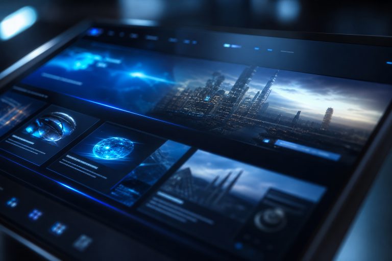
A futuristic website can create instant interest, but visual novelty alone does not earn attention for long. The strongest examples of futuristic design combine expressive visuals with an experience that helps visitors understand what is being offered, why it matters, and what to do next. That balance matters more than ever. Glowing gradients, layered interfaces, immersive animation, and 3D objects can make a brand feel ahead of the curve. However, if the page is slow, unclear, difficult to navigate, or inaccessible, those effects become obstacles rather than advantages.
Why Human-Centered Futurism Works
A site can look advanced without making people feel lost. Visitors are usually not looking for a design experiment. They are trying to compare options, solve a problem, book a service, or learn whether a product fits their needs. The interface can feel new, but the journey should remain calm and easy to follow.
Start With Purpose Before Visual Effects
Before choosing colors, transitions, or 3D assets, define the page's job. Identify the primary visitor, the problem they want to solve, the message they should understand within five seconds, and the next action they should take. Write the headline, supporting copy, and primary call to action first. This prevents a polished visual concept from becoming a page with no clear purpose.
Create A Clear Visual Language
Experimental interfaces need consistency. Choose one dominant background tone, one memorable accent color, and a restrained set of supporting shades. Pair expressive display type with a body font that remains comfortable to read. Generous spacing, repeated shapes, and reliable button styles make the layout feel intentional rather than busy. For example, a technology company might use a near-black background, electric blue highlights, and clean content cards. The accent color can identify actions and important data, while most of the page remains quiet enough for product information to stand out.
Use Motion As A Guide
Animation should answer a useful question. It can show that an item is interactive, reveal a relationship between features, confirm a completed action, or help visitors understand where to look next. Keep essential information visible even when motion does not play, and never delay transitions that access content or navigation. People who reduce animation at the device level should have a calmer experience, which is why teams should respect reduced-motion preferences rather than treating movement as required content. Subtle feedback is memorable. Constant movement is exhausting.
Add 3D And Depth With Care.
Depth can make a website feel immersive by improving understanding. Use a 3D model to show a product from multiple angles, layered panels to separate content from decoration, or a visual sequence to explain a complex process. Glass-like surfaces and gradients can add atmosphere, but they should not reduce text contrast or obscure controls. Test every effect with a simple standard: does it improve orientation, comprehension, or emotion? If the answer is no, remove it. Large visual assets can slow loading, drain mobile batteries, and distract from the message.
Keep Navigation Familiar
Unusual visuals do not require unusual navigation. Keep the menu visible or easy to locate, use labels that describe the destination, and make buttons look and behave like buttons. Visitors should always know how to close a panel, return to a previous view, or continue to the next step. Experimental navigation deserves real testing. Ask someone unfamiliar with the site to find pricing, contact information, and the primary action. If they hesitate, the design needs clearer cues rather than more visual effects.
Protect Mobile Performance
Visual ambition has to work on real phones and real connections. Compress images and 3D files, load scripts only when they are needed, and avoid long introductory sequences. Test the page on mid-range mobile devices, not only on a powerful desktop computer. A fast, stable experience feels more sophisticated than a heavy page that stutters while it loads.
Design For More People
Accessibility strengthens futuristic design by ensuring that important information remains usable across contexts. Use readable type sizes, strong contrast, descriptive button labels, keyboard-accessible controls, and text alternatives for meaningful visuals. The accessibility requirements for contrast, keyboard access, focus, and readable structure provide a practical framework for reviewing these details. Also test Zoom settings, keyboard navigation, screen-reader output, and hover-free interactions. These checks often expose confusing patterns that affect everyone, including people using a phone in bright light or navigating with one hand.
Build Trust Into The Interface
Human details make advanced design believable. Replace vague claims with specific capabilities, explain unfamiliar interactions before asking visitors to use them, and provide visible paths to support, pricing, policies, and contact information. A robotics brand may open with a dramatic animation, but buyers still need clear details about features, delivery timing, costs, and service. Give people control as well. Let them pause sound, reduce movement, dismiss notifications, and understand how their information will be used. Control turns an impressive experience into a respectful one.
Use A Practical Pre-Launch Checklist
Content Check
- Can a new visitor explain what the site offers?
- Are the main benefits easy to scan?
- Do headings accurately describe the sections below them?
Interaction And Technical Check
- Can visitors find the menu and primary action quickly?
- Do buttons, forms, and panels behave predictably?
- Can important tasks be completed without animation?
- Does the layout remain stable while images, fonts, and scripts load?
- Does the page work well on phones, tablets, and desktops?
Accessibility Check
- Can the entire page be used with a keyboard?
- Is the text readable in every section and theme?
- Do controls have clear names, visible focus states, and useful feedback?
Conclusion
A futuristic website does not need to feel distant or difficult. The best designs pair visual confidence with simple language, familiar paths, fast performance, and inclusive interaction. When every effect has a clear job, the website becomes more than decoration. It helps visitors understand, trust, and use the experience more easily. Strong futuristic design can use motion, immersive visuals, interactive elements, and bold layouts without sacrificing usability. The key is to make innovation support the visitor rather than compete for attention. Clear navigation, readable content, responsive layouts, accessible controls, and thoughtful loading behavior should remain at the center of the experience. When technology feels purposeful instead of excessive, visitors can explore new ideas while still knowing where they are, what they can do, and what comes next. The result is a website that feels modern while remaining practical, welcoming, and easy to use.