
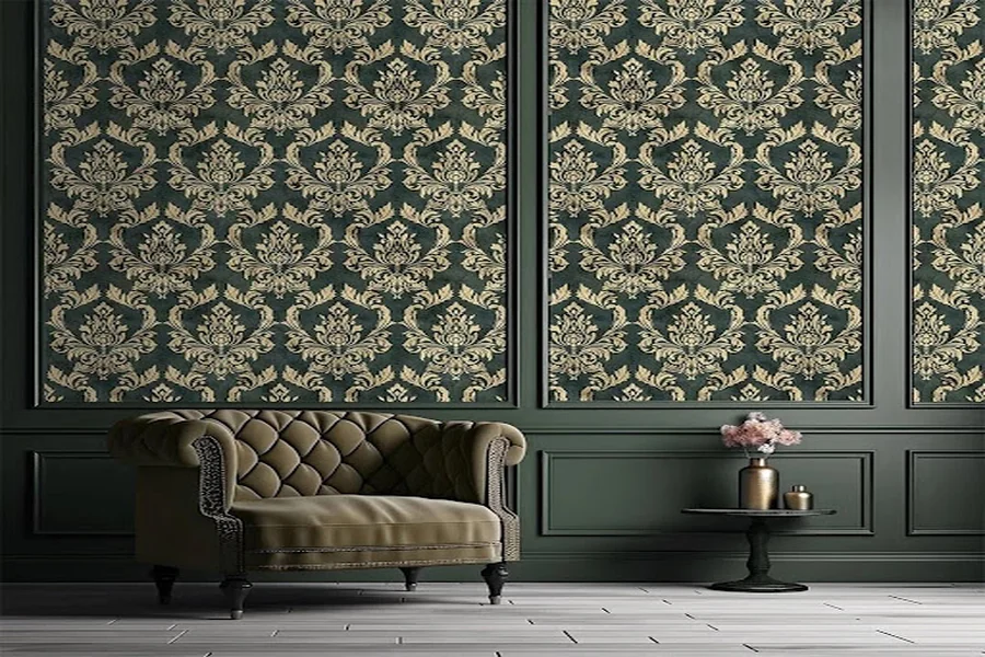
Dark green has a rare ability to make an interior feel dramatic and sophisticated while still maintaining a connection to nature. Unlike black or charcoal, it introduces depth without feeling completely neutral, and unlike brighter greens, it can work as a surprisingly versatile background. The key is choosing the right surrounding palette. With thoughtfully selected furniture, textiles, flooring, and accessories, dark green wallpaper can work in everything from a cozy bedroom to an elegant dining room or contemporary home office.
The best colors to combine with dark green depend on the atmosphere you want to create. Warm whites and beige soften it, wood and brown emphasize its natural character, while black, navy, and metallic accents can make the room feel richer and more dramatic. Understanding these combinations makes it easier to use dark green confidently without making a space feel too heavy.
Why Does Dark Green Work So Well in Interiors?
Green sits naturally between warm and cool tones, which gives it unusual flexibility in interior design. Dark variations such as forest, pine, hunter, and deep olive green can therefore adapt to very different palettes.
The effect also changes considerably depending on the wallpaper itself. A relatively solid dark green background feels calm and architectural, while botanical, floral, geometric, or textured patterns introduce another visual layer.
Dark green is also closely associated with natural landscapes. This makes it particularly easy to combine with wood, stone, linen, rattan, leather, and other materials commonly used in contemporary interiors.
At the same time, it can move in a completely different direction. Pair it with velvet, brass, dark wood, and decorative lighting, and the same color suddenly becomes elegant and luxurious.
White and Off-White: The Safest Combination
White is one of the easiest colors to pair with dark green because it creates clear contrast and prevents deeper shades from overwhelming the room.
However, pure bright white isn’t always the best choice.
Warm whites, ivory, cream, and soft off-white shades usually create a gentler transition. They work particularly well when the green has warm or olive undertones.
You can introduce lighter shades through ceilings, adjacent walls, curtains, bedding, sofas, rugs, or cabinetry. Even relatively small areas of light color can visually balance a large dark green wall.
For example, a bedroom with a deep green accent wall, cream bedding, and pale curtains can still feel airy despite the darker background.
Beige and Taupe for a Warm, Relaxed Interior
If white creates contrast, beige creates harmony.
Warm beige, sand, mushroom, and taupe tones soften dark green without taking attention away from it. This palette works especially well in modern organic, Scandinavian-inspired, minimalist, and contemporary interiors.
Consider combining green wallpaper with a beige upholstered bed, oatmeal-colored curtains, a warm neutral rug, and natural wooden furniture.
The result feels layered but restrained.
Taupe is particularly useful because it bridges the gap between gray and brown. It can therefore help connect green walls with both cool architectural elements and warmer furniture.
Natural Wood and Brown Tones
Few combinations feel as intuitive as green and wood.
Light oak creates a fresh, contemporary contrast, while walnut and other darker woods make the room richer and more traditional. Medium warm woods often provide the most versatile balance.
This pairing works because both colors are familiar from nature. As a result, even a fairly dramatic green wall can feel grounded when surrounded by natural wood.
Brown can also be introduced through leather furniture, woven baskets, wooden picture frames, flooring, or smaller accessories.
For a living room, for example, dark green walls can work beautifully with a cognac leather sofa and warm wooden coffee table. In a bedroom, a walnut headboard or bedside tables can achieve a similar effect without adding another strong color.
Blush Pink and Dusty Rose
Green and pink sit opposite each other in the color spectrum, creating natural contrast. But when both colors are muted, the combination can be surprisingly sophisticated.
Instead of bright pink, consider blush, dusty rose, muted mauve, or clay-based pink tones.
These shades soften the seriousness of dark green and can make a bedroom, dressing room, nursery, or creative workspace feel warmer.
The key is proportion. If green dominates the walls, pink often works best as an accent through cushions, artwork, bedding, an occasional chair, or decorative objects rather than as another major wall color.
Terracotta, Rust, and Burnt Orange
For a warmer and more expressive interior, pair dark green with earthy orange tones.
Terracotta, rust, burnt orange, and clay shades create a rich palette inspired by natural landscapes. The contrast is noticeable, but because both sides of the palette have an earthy quality, they still feel cohesive.
This combination is particularly effective in rooms with warm wood floors and plenty of natural light.
A terracotta armchair against a green wallpapered wall can become a strong focal point. Smaller details, such as rust-colored cushions or ceramics, can achieve a subtler version of the same idea.
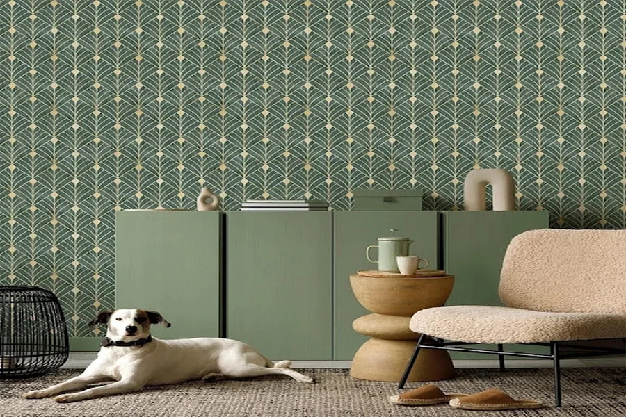
Gold and Brass Accents
Metallic finishes can dramatically change how dark green feels.
Gold and brass bring warmth and elegance, making them ideal for Art Deco-inspired, classic, eclectic, or more luxurious interiors. They can be introduced through lighting fixtures, mirrors, cabinet hardware, picture frames, side tables, or small decorative details.
You don’t need much.
A few carefully selected metallic elements usually work better than using gold throughout the entire room. Against a deep green background, even small brass details become highly visible.
For a more understated result, choose aged brass or brushed metal rather than highly reflective polished gold.
Black for a Modern, Dramatic Look
It may seem counterintuitive to add black to a room that already contains dark green, but the combination can be extremely effective.
Black furniture, window frames, lamps, picture frames, or shelving can sharpen the design and give the space a contemporary edge.
The important factor is balance.
If both the walls and major furniture pieces are dark, introduce lighter flooring, textiles, ceilings, or accessories. Natural light also becomes particularly important.
Black is therefore often best used as an accent rather than a second dominant color.
Can You Pair Dark Green With Blue?
Yes, although this combination requires more consideration than pairing green with neutrals.
Deep navy and dark green can create an enveloping, sophisticated interior, particularly in a study, library, bedroom, or dining room. Because both colors are dark, lighter elements should usually be introduced elsewhere.
For a softer result, muted blue-gray or dusty blue can provide contrast without competing with green.
One useful approach is to allow one color to dominate and use the other selectively. For example, green wallpaper can serve as the main backdrop while navy appears only in an armchair, cushions, or patterned rug.
Gray and Dark Green
Gray can work well with green, but its undertone matters.
Very cool gray combined with a warm olive green may sometimes feel disconnected. Warm gray, greige, stone, and soft charcoal tend to be easier companions.
Light gray creates a contemporary contrast, while charcoal produces a darker, moodier palette.
If a room already contains gray flooring or a gray sofa, dark green can be a useful way to introduce color without completely changing the existing neutral scheme.
Adding warm wood, beige textiles, or brass details can prevent a green-and-gray room from becoming too cool.
How to Choose the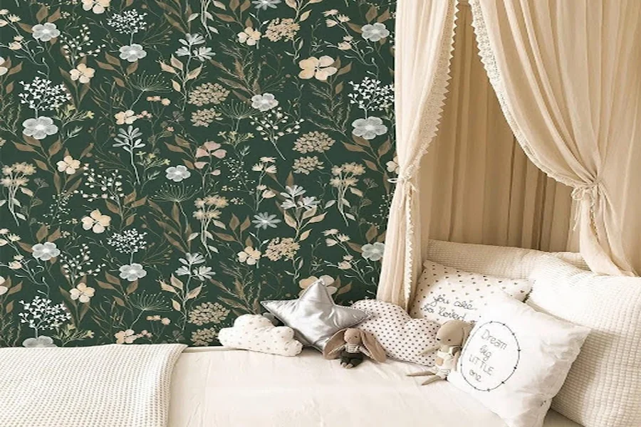 Right Color Combination for Your Room
Before selecting a palette, consider the room itself rather than looking at individual colors in isolation.
Natural light is particularly important. A dark green wallpaper can look significantly different in a bright south-facing room than in a smaller space with limited daylight. Artificial lighting also changes how warm or cool the color appears in the evening.
Next, consider existing elements that aren’t easy to replace: flooring, built-in cabinetry, countertops, large furniture, and window treatments.
Instead of selecting an entirely new palette, look for colors that connect the wallpaper with these permanent features.
Finally, decide what role you want green to play. If the wallpaper should be the main focal point, keep surrounding colors quieter. If you’re aiming for a maximalist or dramatic interior, stronger combinations with pink, rust, navy, black, or metallic accents can work beautifully.
Should Dark Green Wallpaper Cover Every Wall?
Not necessarily.
A dark green accent wall is one of the easiest ways to introduce the color. Behind a bed, sofa, dining table, or desk, it creates a defined focal point without changing the entire visual weight of the room.
Wallpapering all four walls creates a much more immersive atmosphere. This can work particularly well in bedrooms, dining rooms, powder rooms, offices, or other spaces where a cozy feeling is desirable.
If you choose the all-over approach, balance becomes even more important. Light ceilings, appropriate lighting, reflective surfaces, and contrasting furniture can help maintain visual depth.
The wallpaper pattern also matters. A dark background with a large detailed motif will generally feel more dominant than a subtle textured design in a similar color.
A Simple Rule for Building a Dark Green Palette
When you’re unsure where to begin, start with three layers.
Use dark green as the dominant color. Add one main neutral—cream, beige, taupe, or warm gray—to balance it. Then introduce one accent, such as terracotta, blush, brass, black, or navy.
Natural wood can act almost as an additional neutral.
This approach gives the room enough variation to feel intentionally designed without introducing too many competing colors.
Once the basic palette is established, smaller shades can appear naturally through artwork, plants, books, textiles, and decorative objects.
Final Thoughts
Dark green is much easier to decorate with than its dramatic appearance might suggest. Cream and beige can make it softer, natural wood emphasizes its organic character, blush and terracotta introduce warmth, while black, navy, brass, and gold create a more sophisticated atmosphere. The best combination is ultimately the one that responds to the room’s lighting, existing materials, and the mood you want to create.
If you’re considering dark green for an upcoming interior project, explore the different patterns and shades available from CostaCover. Comparing several designs can help you decide whether your space needs a subtle green backdrop or a more expressive statement wall.